JUICE- EP
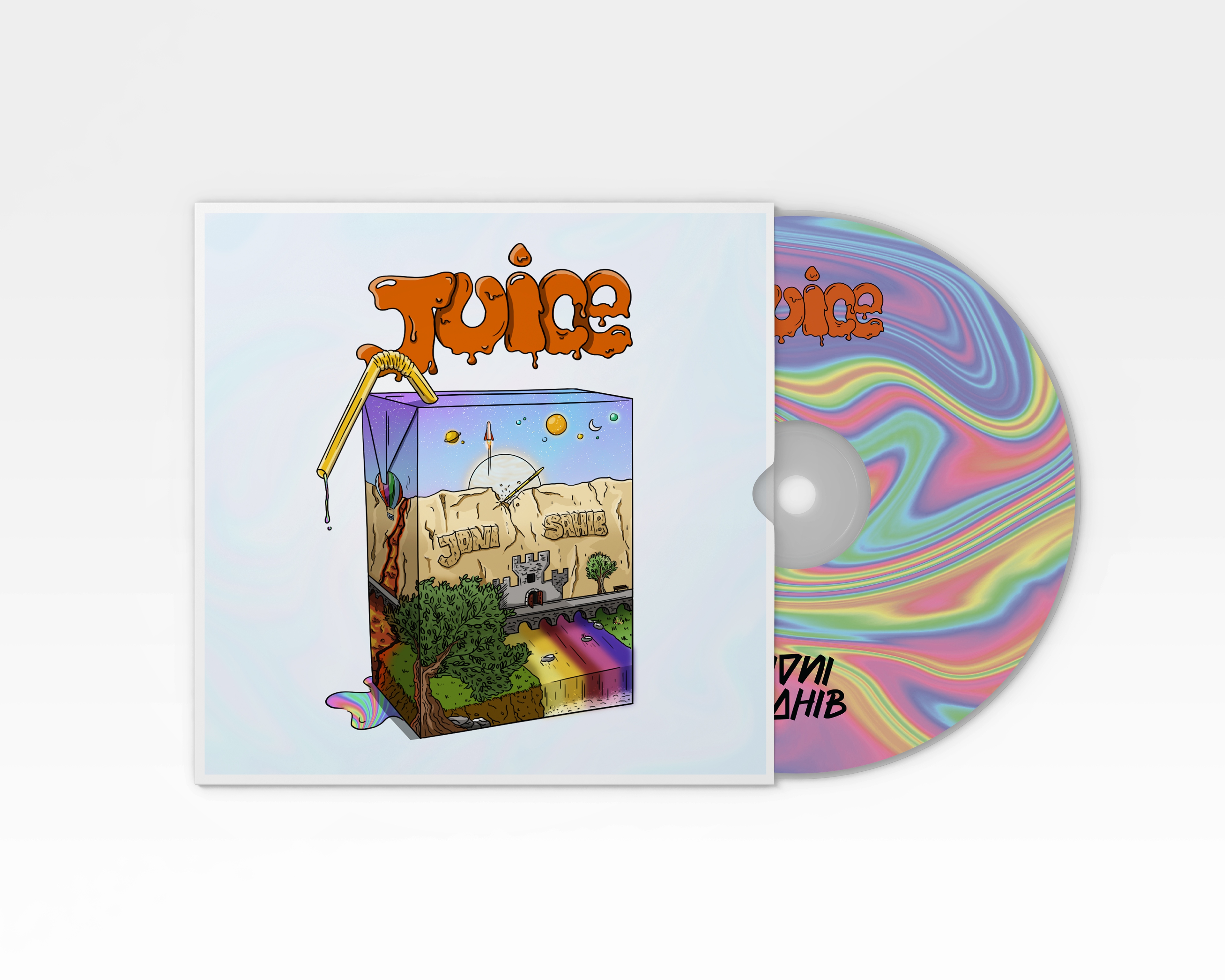
I made this ep design for two Portuguese rappers.
The word juice is used to represent what they have to say in their music. The straw dripping the juice means that they have a lot to say and it is about many different things, that's why the juice itself has many colors.
The sky filled with planets and rockets ships means they want to take their verses out of their town (Trás-os-Montes) and complementing that is the golden pen breaking the mountain represented as a barrier for their words. The castle comes from the symbol of their town's football club as does the bridge with the river underneath it. The CD has the color of the juice because it is inside the cover, meaning the cover is the package and the CD is the juice.
This design was made using Adobe Photoshop
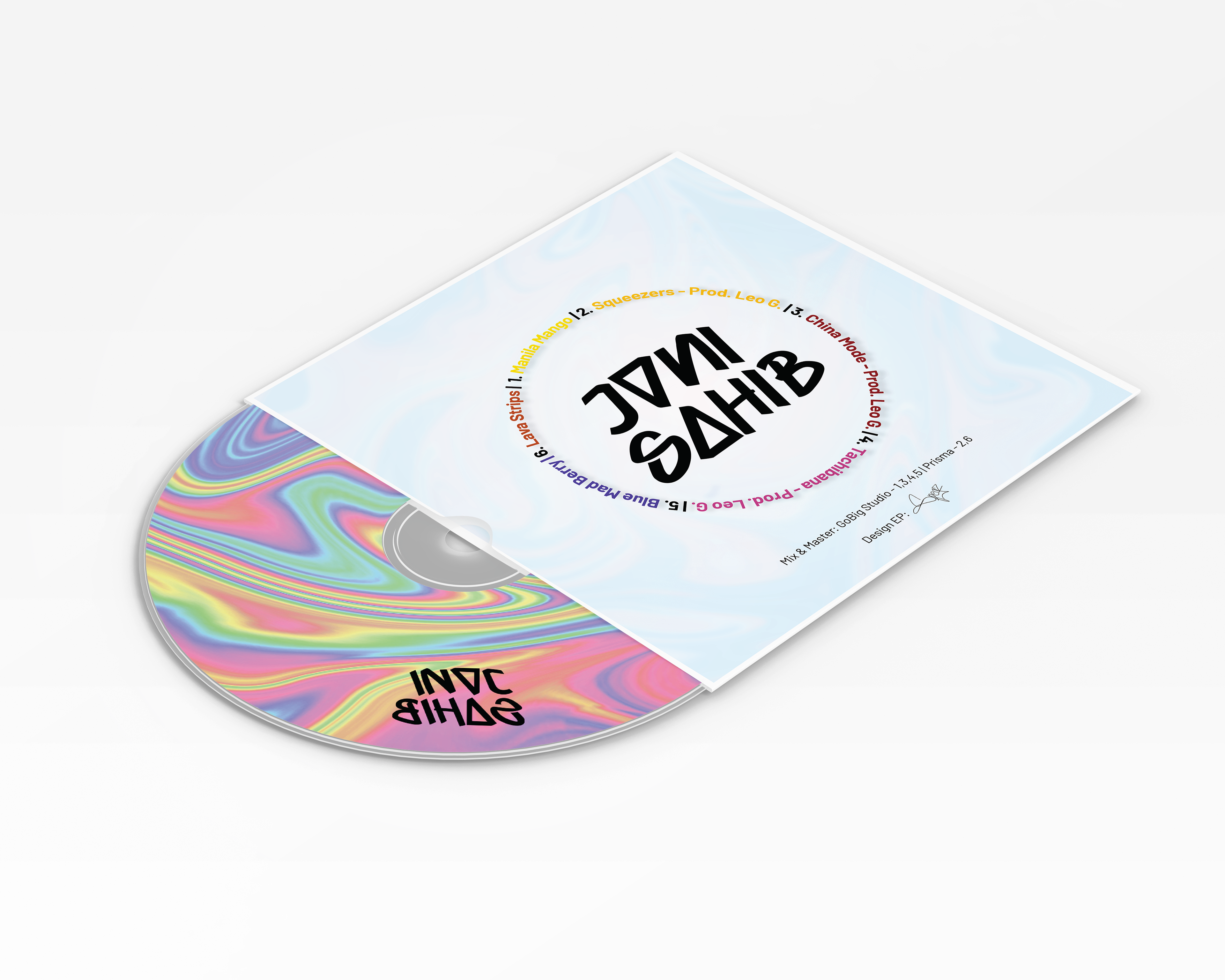
Back side
This is the the back side of the CD sleeve.
It contains the name of the 6 songs on the EP. Each song has a different color to match the difference in style of music. It also has the name of the studio that handled the mix and master of the EP and my signature in the end has the person who did the design.
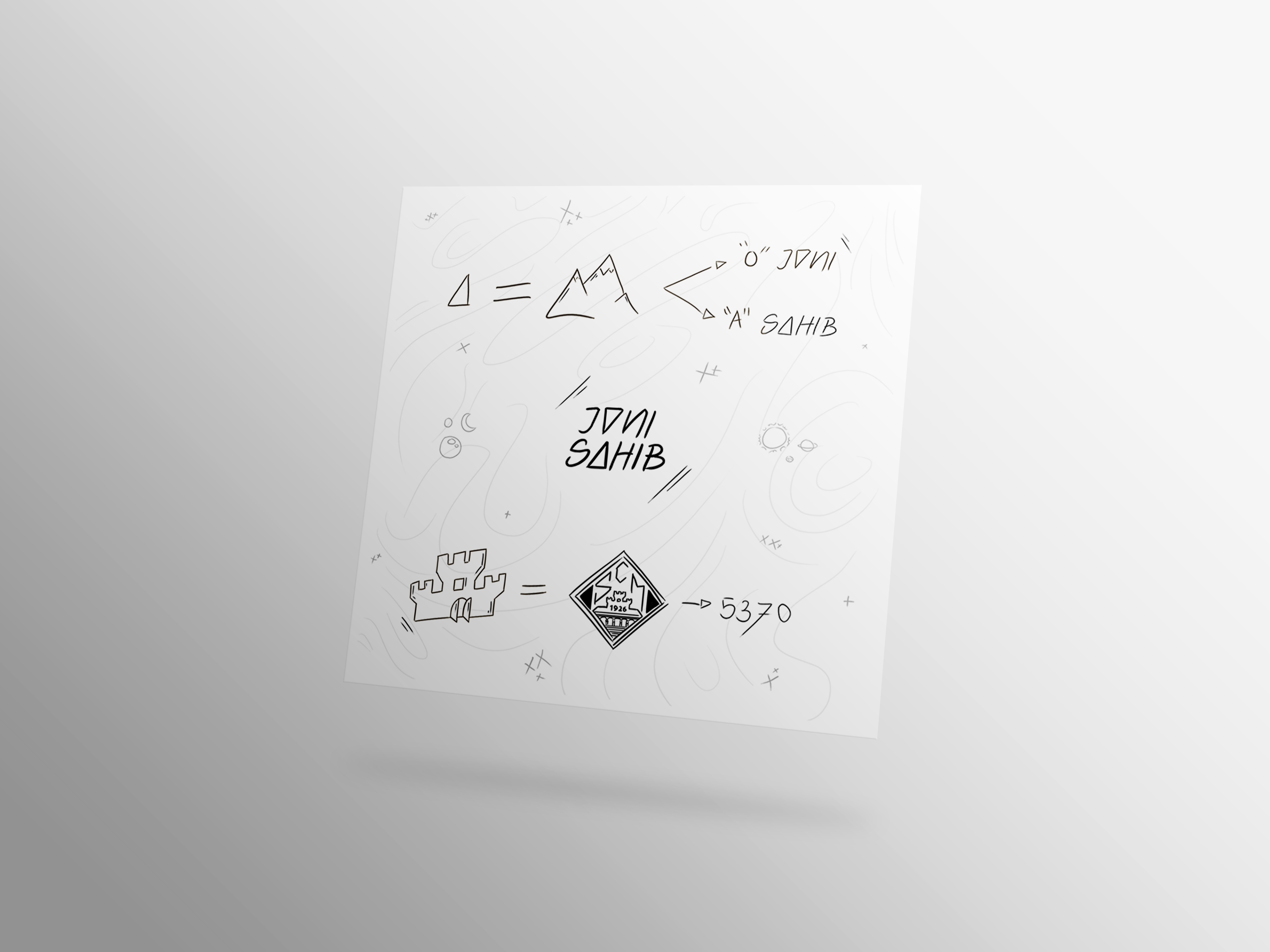
Inside page
Inside the sleeve, there's a page with a brief explanation of some of the design aspects of the cover. It is black and white to mimic a sketch.
The lines on the background represent the colorful juice lines on the CD and on the cover. The triangle used in the logo as the "o" and the "a" in the names represent the mountains of Trás-os-Montes, the place where the rappers are from and as I said previously, the castle goes back to the symbol of the city's football club "Sport Clube Mirandela" and then there's the number 5370 which is the postal code.